蒔絵手帖 15
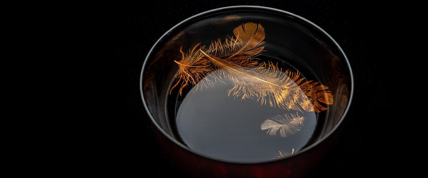
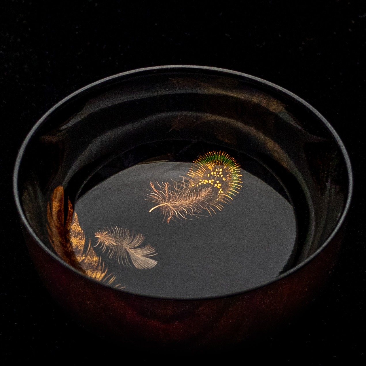
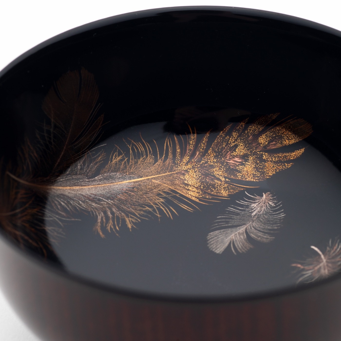
「羽根蒔絵杯 #5」
羽根蒔絵杯でお酒を飲むなら、ぜひ暗いところでわずかな明かりで飲むと良いと思います。
そうすると羽根の奥行きをより感じられますね。
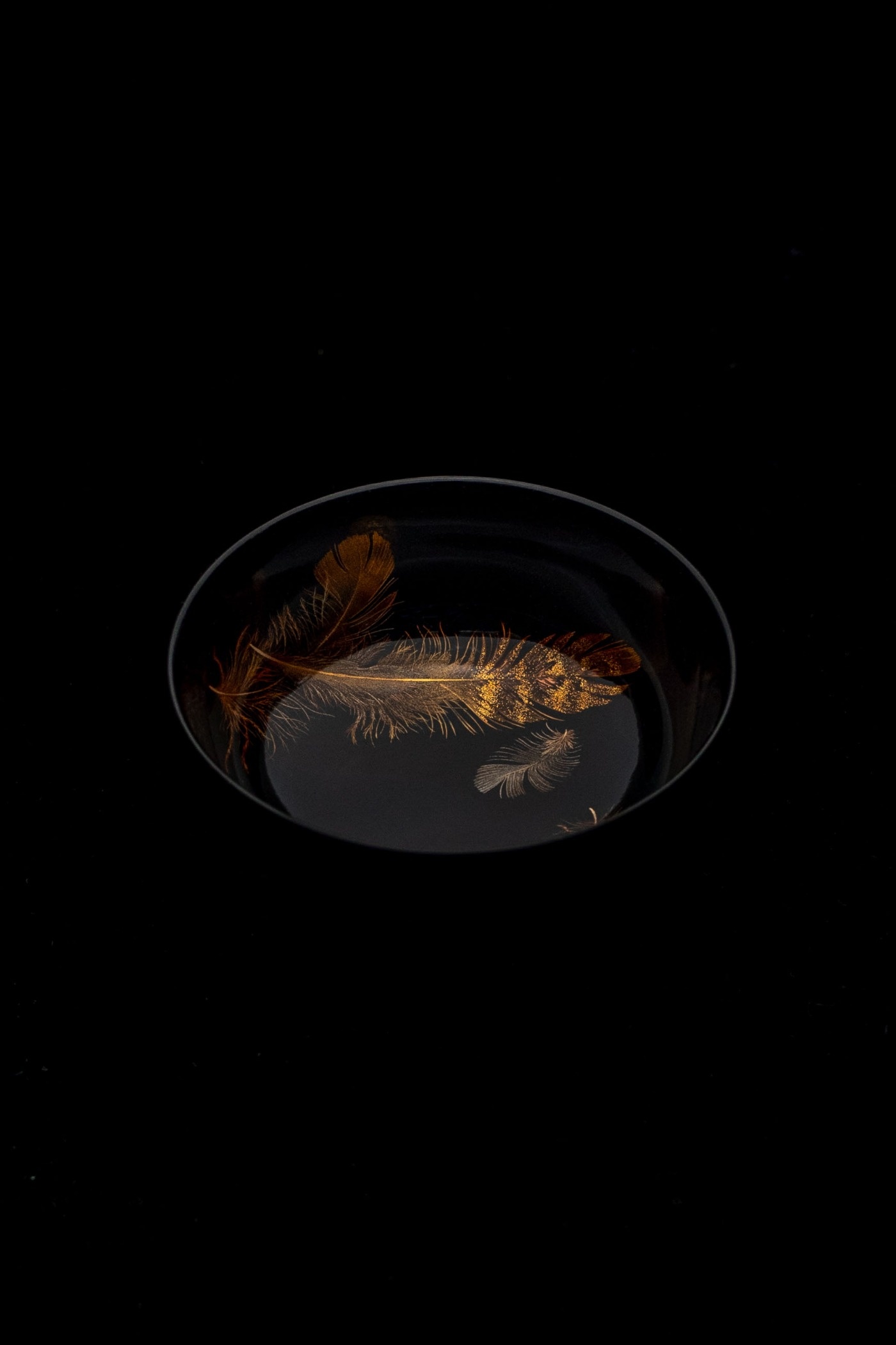
この杯には、4種類の羽根を描いています。
平目粉を多めに使うことで、一つの羽根の中に奥行きのある模様を描けたと思います。形が深めの杯なので、見込みのいちばん深いところから立ち上げる曲面部分に、蒔絵筆で羽根を描くのはかなり難しいことなんですね。難しいとふつうは描きませんが、あえて描くことによって見所になりますし、また、お酒を注いだ時のゆらめきとか、レンズ効果で金粉の粒が際立って見えるといったことも、この曲面部分に描くことで表現できると考えました。
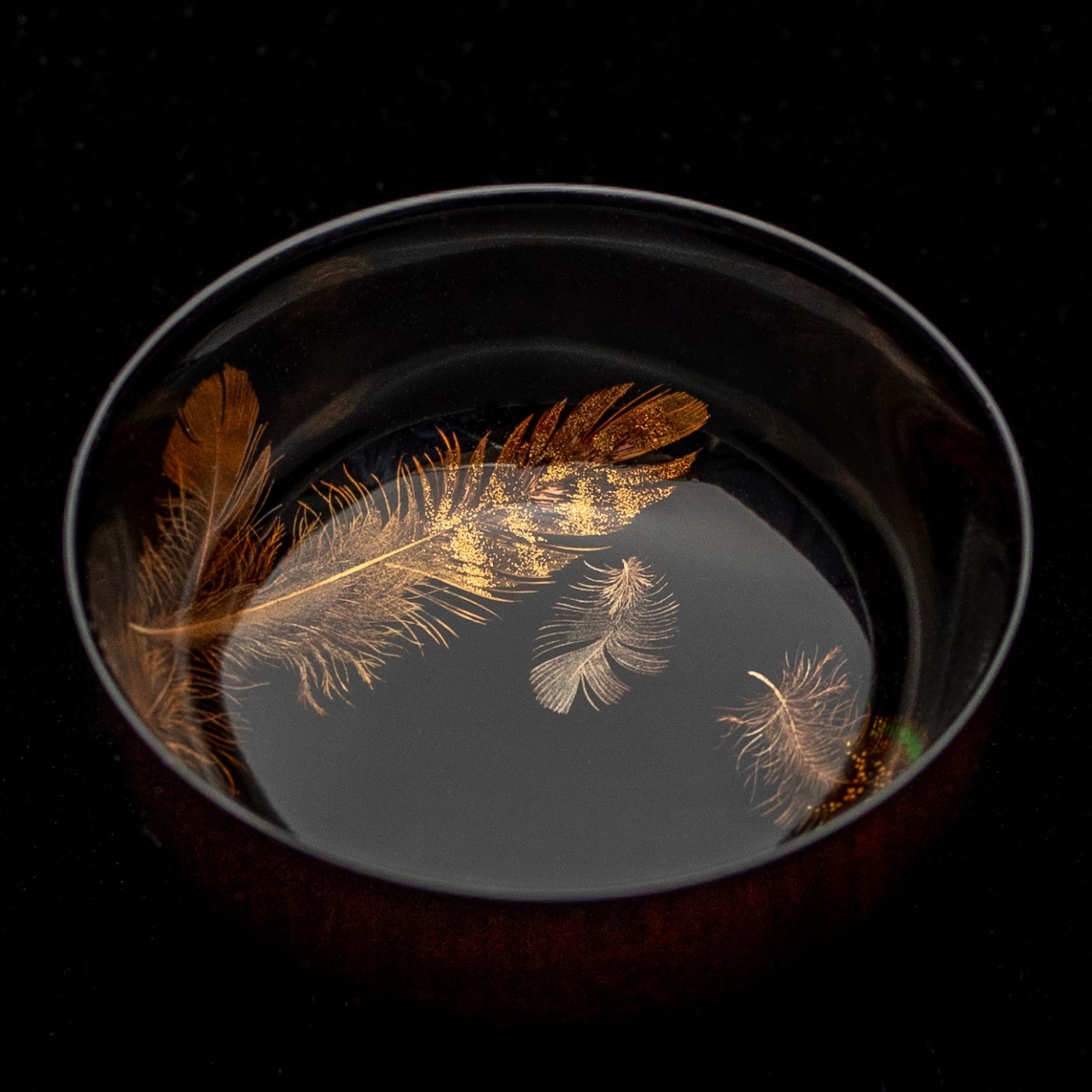
羽根の中に緑色に見えるところも、目を惹くと思います。これは漆に緑色の顔料を入れて、深みのある色になるよう自分で調合しています。
私は渋好みなので、ほとんどの作品において、漆の黒の部分が多いんです。特に蒔絵は金と黒で見せるので、黒をとても大事にしています。全面に羽根を描くのも豪華でいいんですけれど、何も描いていていないところ、間の取り方というか、そういう黒と金の対比というのが、私は蒔絵の醍醐味だと思っています。
同様に、金粉のぼかし、というのも蒔絵には重要ですし、金がとても輝いている隣には、銀で少し落ち着いた光を出したりとか、線で表現した時には、その隣には面で置いたりとか、そうしたコントラストについては、構図や配置を決める時に意識しています。

基本的には、すべて研ぎ出す「研ぎ出し蒔絵」ですけれど、あえて蒔絵の上に漆を残したりということもします。それは隣り合う金粉との兼ね合いで、その方が奥行きが出そうとか、臨機応変にその時その時で変えていきます。
漆を研ぎ出さずに残す厚みや、金粉の粒子の違いというのも十何種類もあるので、それを使い分けています。あえて斜めに金粉を置いてみたり、真っ平らに置いてみたりと、羽根の種類によって変えています。平目粉は展覧会の会場などでは映えますし、梨子地粉は平目粉より少し薄いので、少しだけやわらかく光って、赤っぽく見えるところが多くなります。
私にとって羽根蒔絵は、正解があるようで正解はないものです。
偉大な先輩に白山松哉(しらやましょうさい。明治、大正時代に活躍した漆芸家。羽蒔絵は再現不可能といわれた)という名工もいますけれど、白山松哉を目指そうとは思っていません。作品を見ると感動しますけれど、そもそもどうやって作っているのかわからないですから。
私は今見えている自分の感覚の中で、ちょっとこの世のものではない雰囲気というのをもっと立体的にしていきたい、羽根の絵としての完成度を求めていきたいというふうに思っています。蒔絵というのは金属粉で描くわけで、この世に金属の羽根は実在しないので、そこの魅力というのがあるんです。
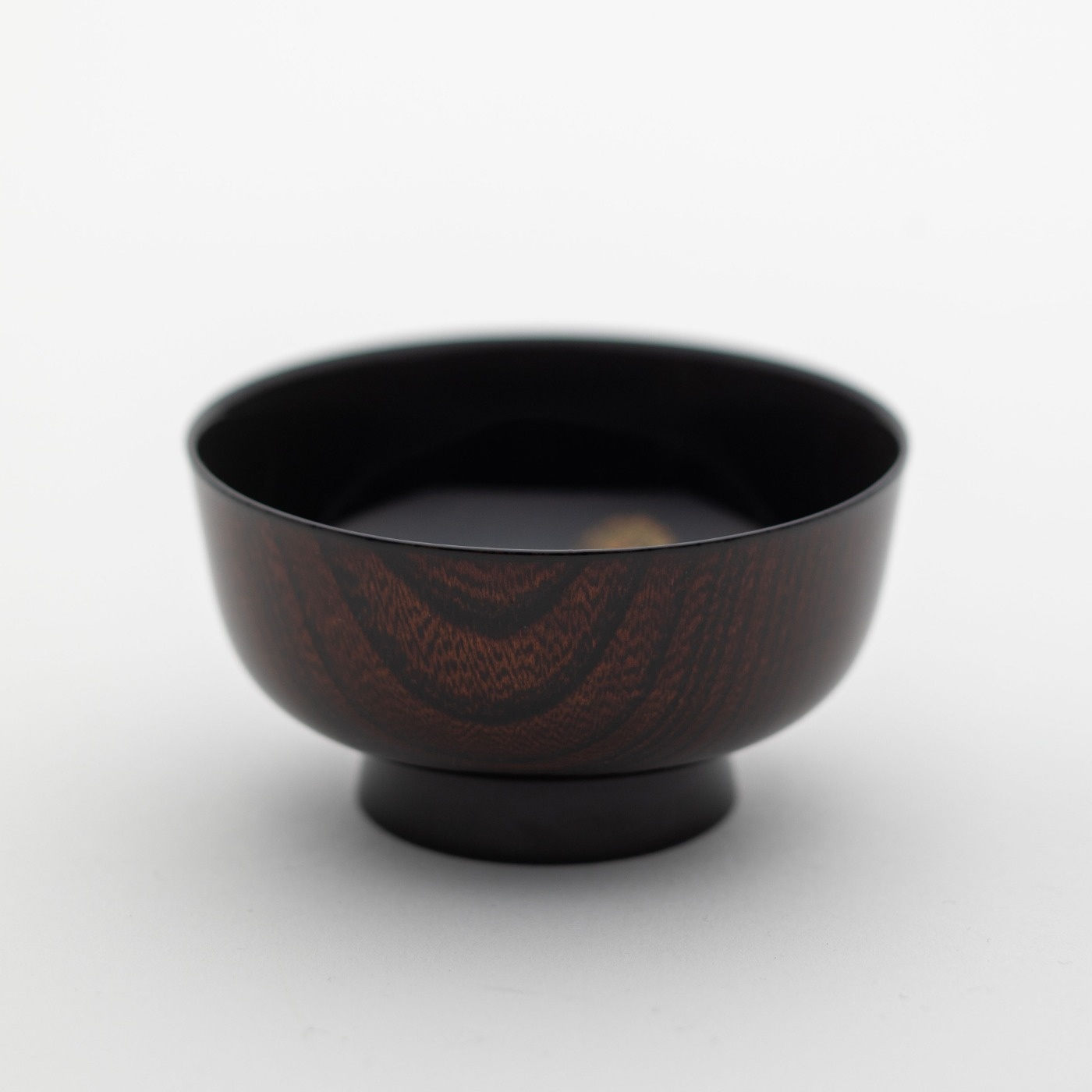
この杯の木地にはケヤキを使っていて、木目がきれいなので、外側を木地溜めという仕上げにしました。木地に透き漆を塗っていて、漆の奥の方に木目が見えるという技法です。
蒔絵と木地溜めの取り合わせも、ぜひ楽しんでいただきたいです。
If you're drinking sake from a Feathers Makie Sake Cup, I recommend drinking it in a dark place with a dim light.
This way you can feel the depth of the feathers even more.
I decorated with makie about four different types of feathers on this cup.
This time I used a lot of gold powder called Hiramehun, I was able to create a pattern with depth in each feather.
Because the cup is deep, it was quite difficult to paint feathers on the curved surface that rises from the inside of the cup with a Makie brush.
I chose to paint even in areas that are considered difficult to paint, and that became the highlight.
I also thought that by painting on this curved surface, I could express the fluctuations that occur when alcohol is poured into a glass, and the lens effect that makes the gold leaf appear.
The green feathers are also eye-catching.
Green pigment is added to the lacquer to create a deep color.
I like a modest, textured atmosphere, so most of my works have a lot of black lacquered areas.
Makie in particular is shown with gold and black, so I really value black.
Painting feathers all over the piece is gorgeous, but leaving empty spaces makes the contrast between the black and gold look more beautiful, and I think this is the true joy of maki-e.
Similarly, the shading of gold powder is also important in makie,and next to bright gold, I'll use silver to create a more muted light,or when expressing something with lines, I'll place it next to a surface,and I keep these kinds of contrasts in mind when deciding on the composition and placement.
Basically, this is a technique called "Togidashi Makie", in which all the lacquer is polished off, but sometimes the lacquer is intentionally left on top of the makie.
This is determined by the balance with the adjacent gold powder, and I change it flexibly depending on the situation, such as whether it creates a deeper finish.
There are over 10 different grain sizes of gold powder, which are used depending on the purpose.
I change the gold powder depending on the type of feather, deliberately placing it at an angle or laying it flat.
The “Hiramehun” gold powder looks great in exhibition venues, and the "nashijihun” is a little thinner than Hiramehun, so it shines a little softer and appears reddish in many places.
To me, feathers makie is something that seems like there is a right answer, but there is no right answer.
One of my great predecessors is the master craftsman Shirayama Shosai (a lacquer artist active during the Meiji and Taisho periods, whose feathers makie was said to be impossible to reproduce), but I have no intention of aiming to be like Shirayama Shosai.
I am impressed when I see his works, but I create in my own way, striving for what I want.
I would like to use my current sensibilities to create a more three-dimensional, almost otherworldly atmosphere and improve the quality of my feather drawings.
Makie is created using metal powder, and metal feathers do not exist in this world, so I find that fascinating.
The wood used for this cup is zelkova, which has beautiful grain, so the outside has been finished with a technique called kiji tame.
The wood is coated with transparent lacquer, allowing the wood grain to be seen through the lacquer.
I hope you enjoy the combination of maki-e and kiji tame.