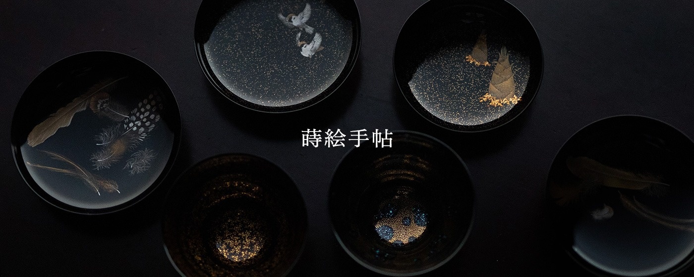
蒔絵手帖 14
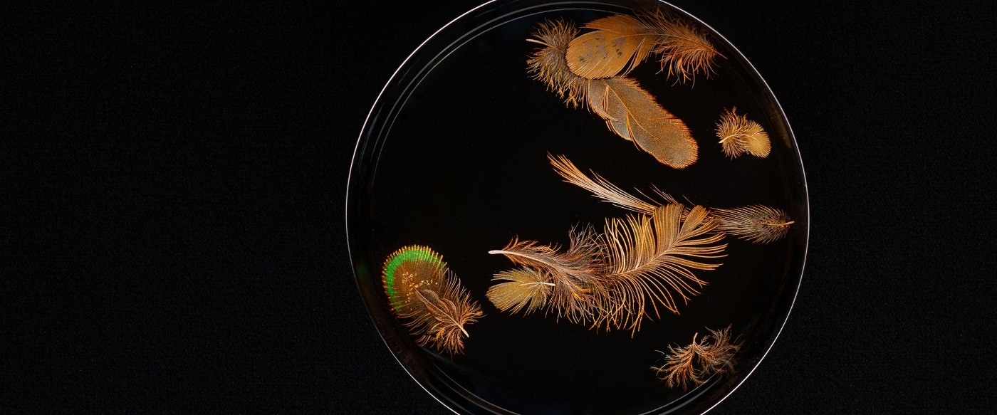
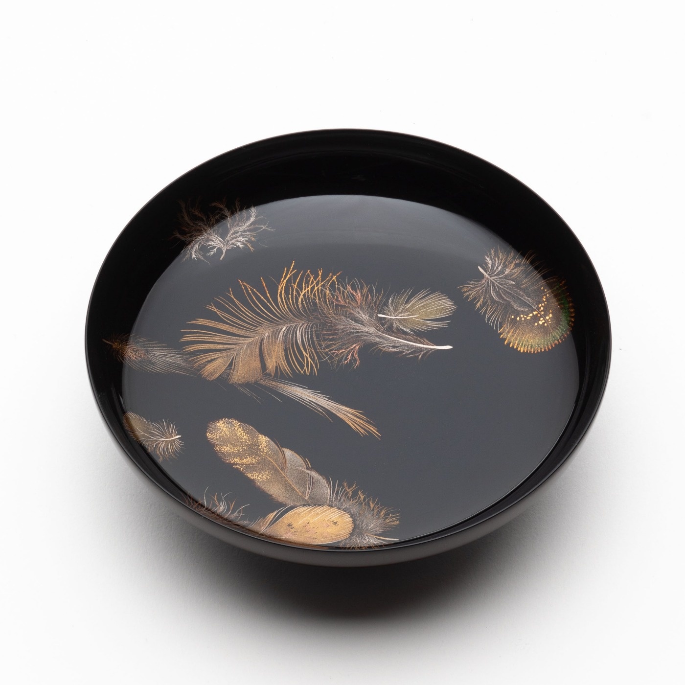
「羽根蒔絵杯 #4」
以前、蝋燭だけを灯した茶室で、羽根蒔絵杯を見る機会がありました。周りがほぼ見えない、手もとの器すらよく見えない暗闇の中、ふわっと羽根だけが浮き上がってきて…。それはとても感動的な光景でした。以来、忘れることのない記憶となり、ふとした瞬間によく思い出します。

私はこれまでに十何種類かの羽根蒔絵をつくってきましたが、制作の度に、少しずつ金粉の使い方を変えているんです。いかに実物の羽根に近づけるか、というよりは、いかに羽根のように見えるか、ということを毎回研究しながら、羽根蒔絵を創作しています。
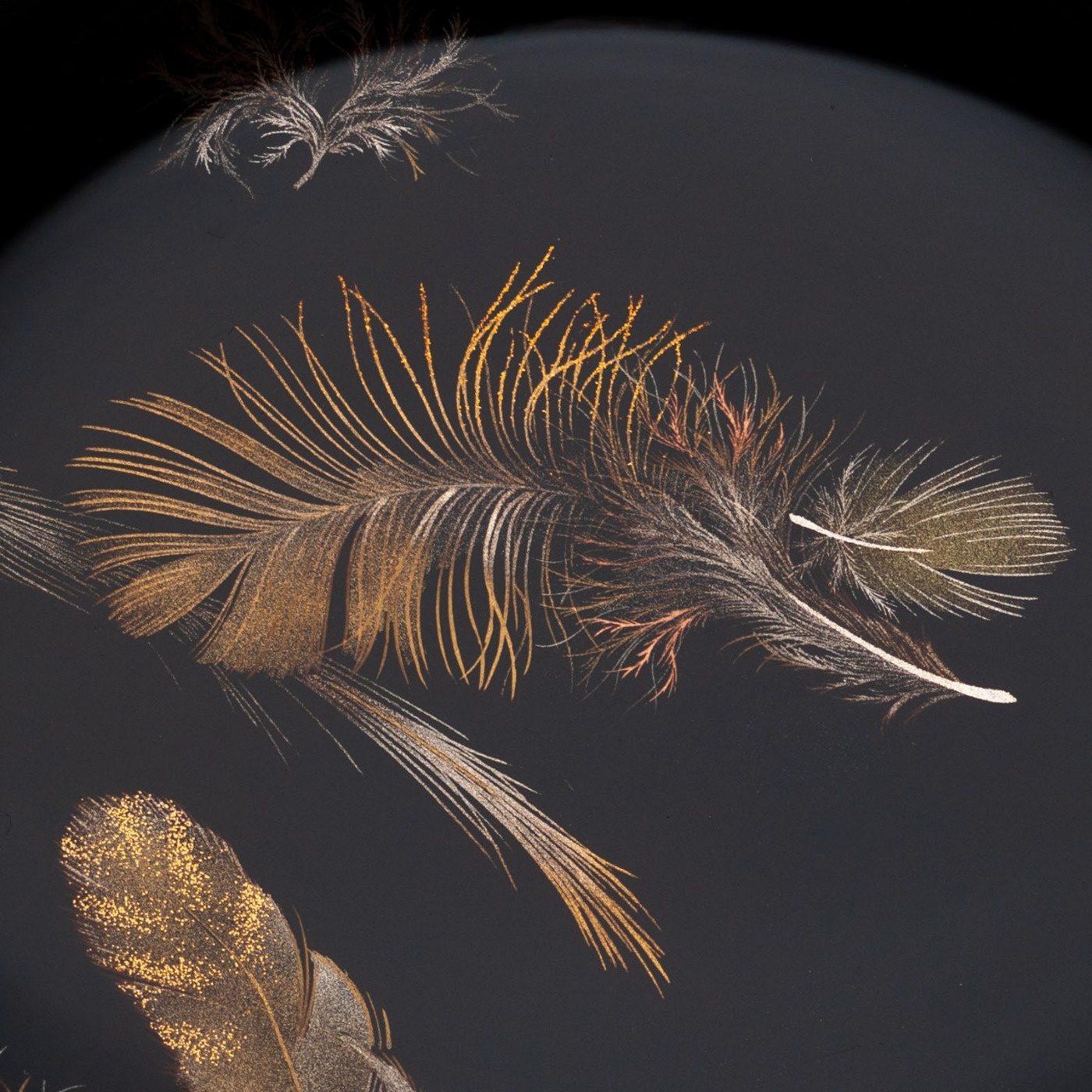
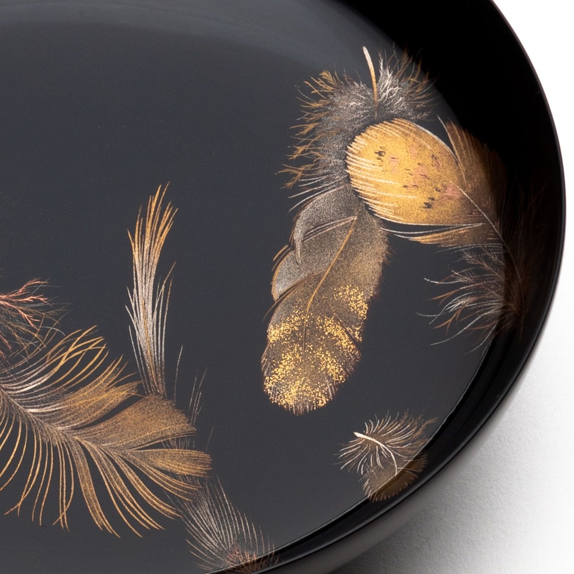
この杯には8種類ほどの羽根を描きました。
今回は、平目粉といって、梨子地粉よりも少し厚みのある金粉を使いました。これは金の輝きが少し強いんですね。羽根を蒔絵で描くと、ペタッと平坦に見えてしまいがちなんですが、そこに奥行きを出したり、重厚感を出したりということをしたくて、今回は平目粉を使ってみました。
隣り合っている羽根は、面で見えるように描いたり、線で見えるように描いたりとあえて変化をつけています。

口縁の近くに描いた羽根に、緑色の漆を使っているところがあります。
色を使うと、目の錯覚でその部分だけが手前に出てくるように見えるため、他の部分と同一平面には見えにくくなるんですね。そこをどうやって同一平面に見えるようにするか。材料の使い方などを工夫していますが、0.01とか0.02、0.03ミリという薄さの中で、そこを表現するというのが、この羽根蒔絵の難しいところです。
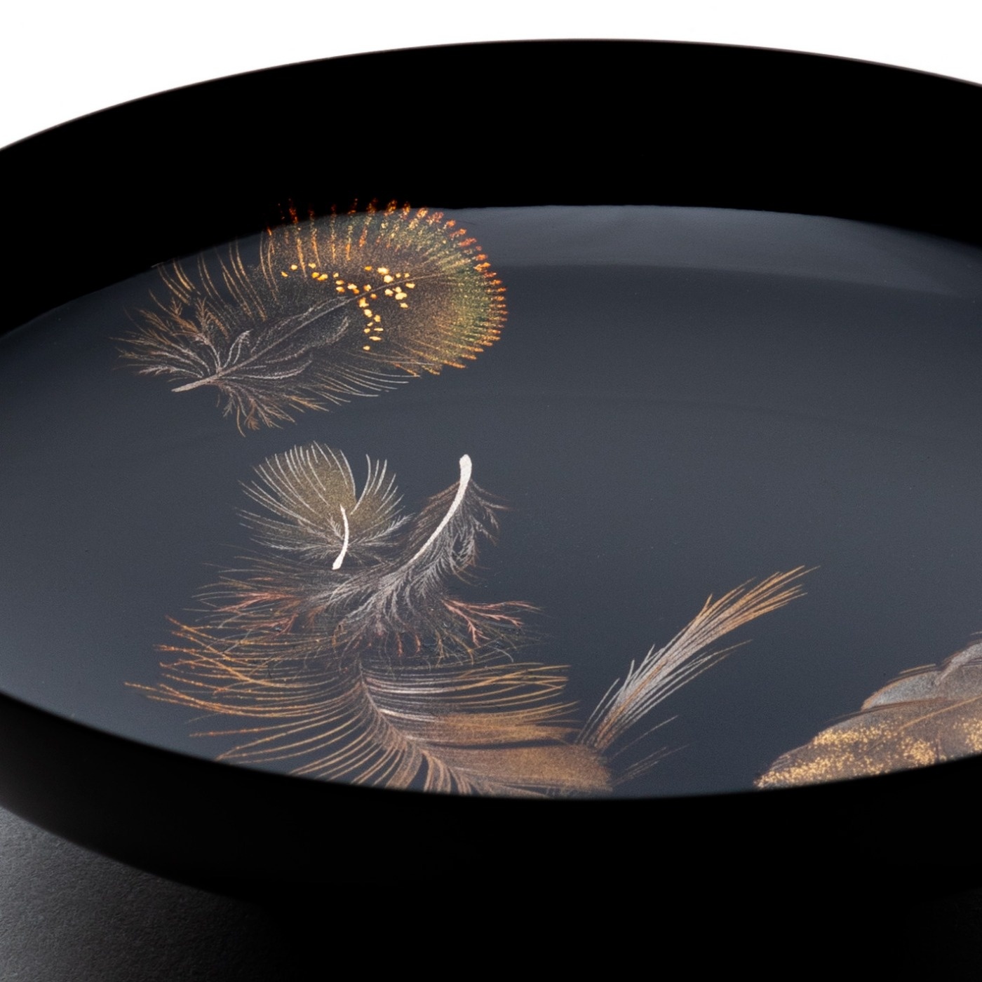
羽根蒔絵は、線が細ければ細いほど良い、というわけではなくて太い線も絡ませて細さを強調します。絵画と同様ですね。
蒔絵というのはまず漆で線を描いて、そこに金粉などを蒔きます。
漆で線を描く際は筆で描きますので、ふだんから習字で筆の練習をしています。かなを続け字で書くことを連綿と言いますけれど、前後のかなを続ける細い線、跳ねて次へつないでいく線というのは、筆を紙から離さずに意識を集中して書きます。
瞬間的な集中力が必要なんですね。毎朝、かなを連綿で書くという習字の習慣は、羽根蒔絵の制作にも生きていると思います。
羽根の羽毛の部分などは、たった1ミリの中に10本の線を描くわけですが、こうすれば描けるというのは実は無くて、日ごろの訓練が大事なんです。
今では羽根蒔絵のために特別な練習をしなくても、日ごろの訓練で描けるようになりましたが、以前はかなり練習して、コツとか感覚がどこなのかというのを探っていました。筆の毛先の1本で描いていますので、それを維持するにはかなりの集中力がいるんですね。そこが、かな文字を連綿で書く、次につないでいく細い線を書く時の意識と似ているんです。
習字は懸腕(けんわん)と言って、腕を水平に上げて、肘を脇から離して、筆が垂直になるようにして書くんですね。僕は何かに腕を安定させて書いたりはしないので、ふだんから腕を自由に動かすことに慣れているのかもしれません。もちろん羽根蒔絵の時は、指をついて安定させていますけれど、連綿や懸腕というふだんの習字のやり方というものが、自分の制作に息づいている実感はあります。
そうしたことが出来るようになったのは、ここ10年くらいのことです。その前の10年くらいは線も太くて、そもそも筆の毛先1本で線を引くなんてできませんでしたから。
特別な筆を使っていても、毛先1本で描く安定性がなくて、腕がまだまだだったんです。筆は鼠の毛のものを使っています。最近はキツネの毛を使った筆も開発されていて、次はそれで描いてみようかと思っています。とはいえ、動物は個体差があるので、同じ動物でも硬い毛、柔らかい毛さまざまで、それは使ってみないとわからないことです。
この杯は表側は漆の黒、外側は漆の潤で、今回は名前を朱で入れました。黒と潤と朱というバランスも僕の好みです。
I once had the opportunity to see a “Feathers” Makie Sake Cup in a tea room lit only by candles.
In the darkness where you could barely see your surroundings, and couldn't even see the sake cup in your hand, just the feather floated up...
It was a very moving sight.
It has been an unforgettable memory ever since, and I often think back on it at random moments.
I've created over a dozen different types of feathers makie so far,
and each time I create one, I change the way I use the gold powder slightly.
When I draw feathers, rather than drawing them realistically, I study how to express them in a way that conveys the feeling of feathers.
I decorated with makie about eight different types of feathers on this cup.
This time I used a type of gold powder called Hiramehun, which is a little thicker than Nashijihun.
This gives the gold a stronger shine.
When feathers are painted with Makie, they tend to look flat and simple,
but I wanted to add depth and a sense of weight, so I used Hiramehun this time.
I deliberately added variation to adjacent feathers, sometimes drawing them to look like surfaces and sometimes as lines.
The feathers painted near the rim of the sake cup has a section painted with green lacquer.
When color is used, it creates an optical illusion that makes that part appear to be in front,
making it difficult to see that it is on the same plane as the rest of the piece.
The question is how to make that part appear to be on the same plane.
We've devised ways to use materials, etc., but the difficult part of feather maki-e is expressing that within a thickness of 0.01, 0.02, or 0.03 mm.
In feathers makie, the thinner the lines, the better, but thicker lines are also intertwined to emphasize their thinness. Just like in painting.
With makie, I first draw lines with lacquer and then sprinkle gold powder on them.
Since the lacquer lines are drawn with a brush,
I regularly practice my brushwork in calligraphy.
Writing consecutive kana characters is called renmen,
and the thin lines that connect previous and following kana, or the lines that jump and connect to the next,
require concentration and writing without lifting the brush from the paper.
This requires concentration.
I believe that the calligraphy habit of writing kana characters continuously every morning is also alive in the production of the feathers makie sake cups.
The make feather part, I have to draw 10 lines in just 1 mm,but there's no one way to draw them; daily practice is important.
Now I can draw feathers makie through daily training without any special practice,
but in the past I would practice a lot, trying to find the trick or the feel.
You draw using just the tip of the brush, so it takes a lot of concentration to maintain that concentration.
In that respect, it's similar to the awareness you get when writing continuous kana characters, or drawing thin lines that connect to the next one.
In calligraphy, you write with your arm raised horizontally, your elbow away from your side, and the brush held vertically. This is called 'kenwan’.
I don't keep my arm still when I write,
so perhaps I'm just used to being able to move my arm freely.
Of course, when I draw feather maki-e I steady my body with my fingers,
but I feel that the fundamentals of calligraphy, such as renmen and kenwan, are firmly alive in my work.
It's only in the last 10 years or so that I've been able to do this.
For the 10 years before that, the lines were thick and it was impossible to draw a line with just the tip of a brush.
Even when I used special brushes, I didn't have the stability to draw with just the tip of a brush, so my skill still had a long way to go.
I use calligraphy brushes made from mouse hair.
Recently, brushes made from fox hair have been developed, so I'm thinking of trying those out next.
However, each animal is different, and even the same animal can have a variety of hard and soft hair,
and I won't know until I try it.
The outside of this cup is painted with lacquer that is a dark brown color, and this time I wrote the name in vermilion.
I also like the balance of the black, dark brown, and vermilion of the lacquer.